← → · space · F fullscreen
Our site, next to five YC peers
I spent some time over the last few days comparing our site to other small dev-tools companies. Sharing what I noticed, and where I think we could do better.
12/30
My score for our site
26/30
Median across the five peers
By my count we're at roughly 45% of the peer median. Coming up: a look at two direct competitors first (Vignesh's suggestion), then the YC peer comparisons and a scorecard. Each row of the scorecard links to a short write-up if anyone wants to see how I got there.
01 / 19
Why I think this is worth a closer look
A few reasons that came up for me while looking through this. The third one is the one that's been on my mind the most.
01 · First impression
The site is what a security buyer sees first
When a CISO lands on our page, they form an impression of how seriously we take the product in those first few seconds. I don't love how much weight gets placed on that, but it seems to be pretty consistent in what I've read about how B2B buyers behave.
02 · Pattern recognition
A lot of AI dev-tools sites look alike right now
I've noticed a pattern across a bunch of recent AI sites in our space. They tend to use similar default styling, similar gradient headlines, similar pill labels. When someone is looking at five of these in a row, ours can blend in instead of standing out.
03 · The irony
We sell AI security, but our site might look AI-built
This is the one that's bothered me most. Selling AI governance from a site that has the visual signature of an AI-generated template feels a bit off to me. I'm not sure how much it matters for conversion, but a thoughtful buyer might notice without being able to name why.
02 / 19
Before the YC peer set, two direct competitors
Vignesh suggested I also look at companies that sell into the same buyer as us, since those are the sites a CISO would put next to ours when shortlisting. Two stood out as worth a closer look: Runlayer and Mint MCP. Both sell AI governance for the enterprise, and both are on the radar for the kind of teams we talk to.
UnboundAI agent security · what we sell
RunlayerAI enablement and control · same buyer
Mint MCPGoverned MCP rollout for Claude / Cursor · adjacent
A small note on framing: I'm not scoring these on the same ten-axis rubric as the YC peers below, because the goal here is different. The YC set is the design-craft benchmark. This pair is the buyer-reference frame: what someone evaluating us sees on the other tabs of their browser. So this section is just observations, not numbers.
03 / 19
Their landings, next to ours
Same page type, captured the same day. A few things both of them do that ours doesn't.
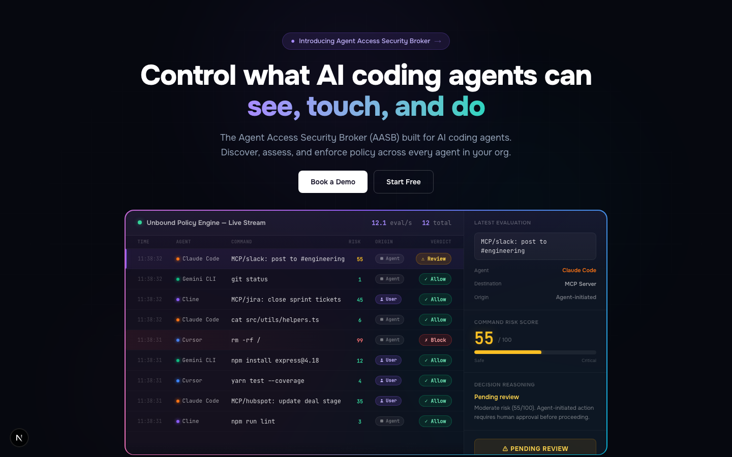
Unbound/
Pill eyebrow at the top, gradient text on the headline phrase, a mock dashboard to the right, and a few floating background blobs. Same observations as elsewhere in the deck.
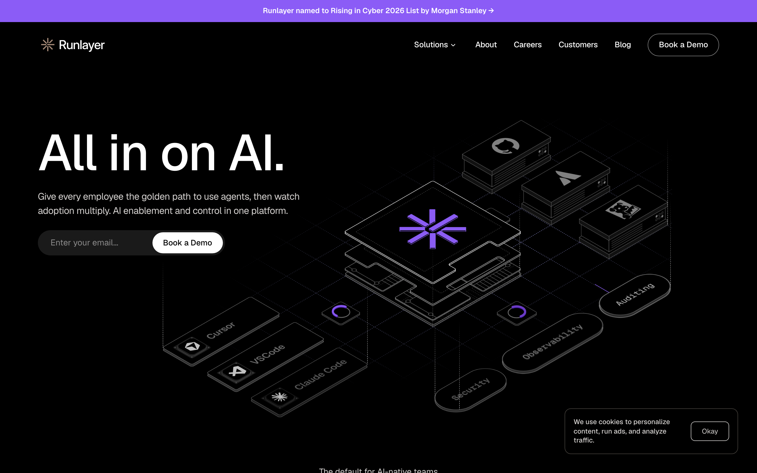
Runlayer/
A confident four-word headline ("All in on AI."). A bespoke 3D illustration of their platform stack as the hero anchor, with named modules. The same purple family as ours, but committed only in the logo and the illustration accent. One CTA, plus a quiet email capture.
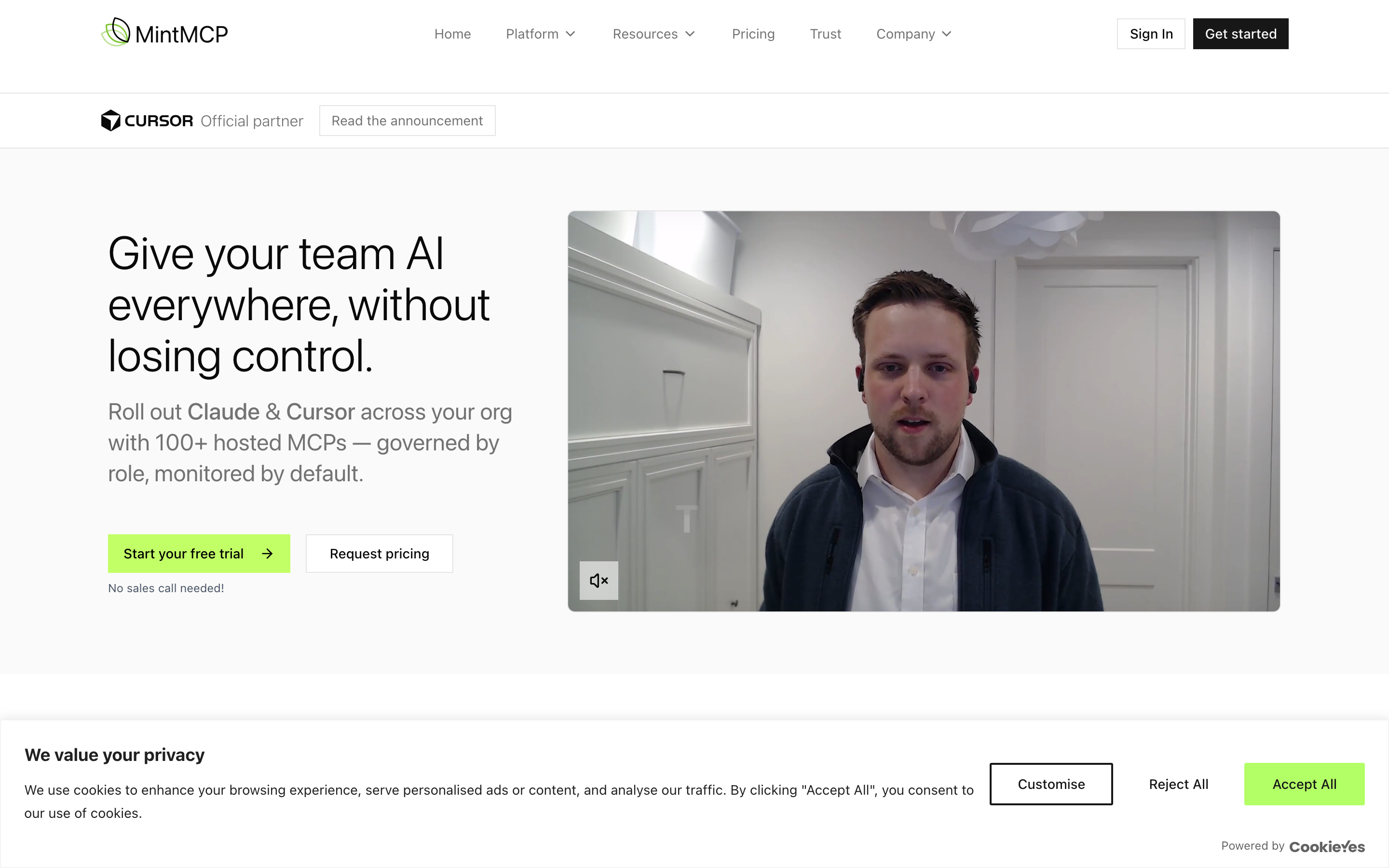
Mint MCP/
A problem-led headline that names the outcome and the trade-off in one sentence. A video tile with a real person as the hero anchor, not a UI mock. A "Cursor · Official partner" chip below the nav. Green primary CTA with "No sales call needed!" alongside.
04 / 19
What I'd borrow from each of them
A few specific moves I think we could learn from, page by page.
Runlayerrunlayer.com
- The hero anchor is bespoke and specific to their product. A 3D illustration of their platform stack with named modules. Not a generic console mock.
- The headline is four words and confident: "All in on AI." No qualifier, no gradient, no eyebrow above it.
- Trust signal at the top of the page is earned and specific: "Named to Rising in Cyber 2026 List by Morgan Stanley." Probably worth more to a CISO than a SOC 2 badge.
- Their purple is the same family as ours. The difference is they commit it in two or three places, and let the rest of the page sit in black and grey.
Mint MCPmintmcp.com
- The headline names the buyer's actual concern: "Give your team AI everywhere, without losing control." Outcome plus trade-off in one line.
- The hero anchor is a video tile of a real person, presumably their founder. It's the most human thing on any of the sites I looked at.
- Trust signal is a "Cursor · Official partner · Read the announcement" chip below the nav. A name the buyer recognises, with a link to the actual announcement.
- The CTA pair is properly tiered: green primary "Start your free trial" with a secondary "Request pricing." The small "No sales call needed!" line removes the most common B2B friction.
05 / 19
And their pricing, next to ours
The page where someone decides to actually pay. Mint MCP makes a few specific choices on theirs that I think are worth noting.
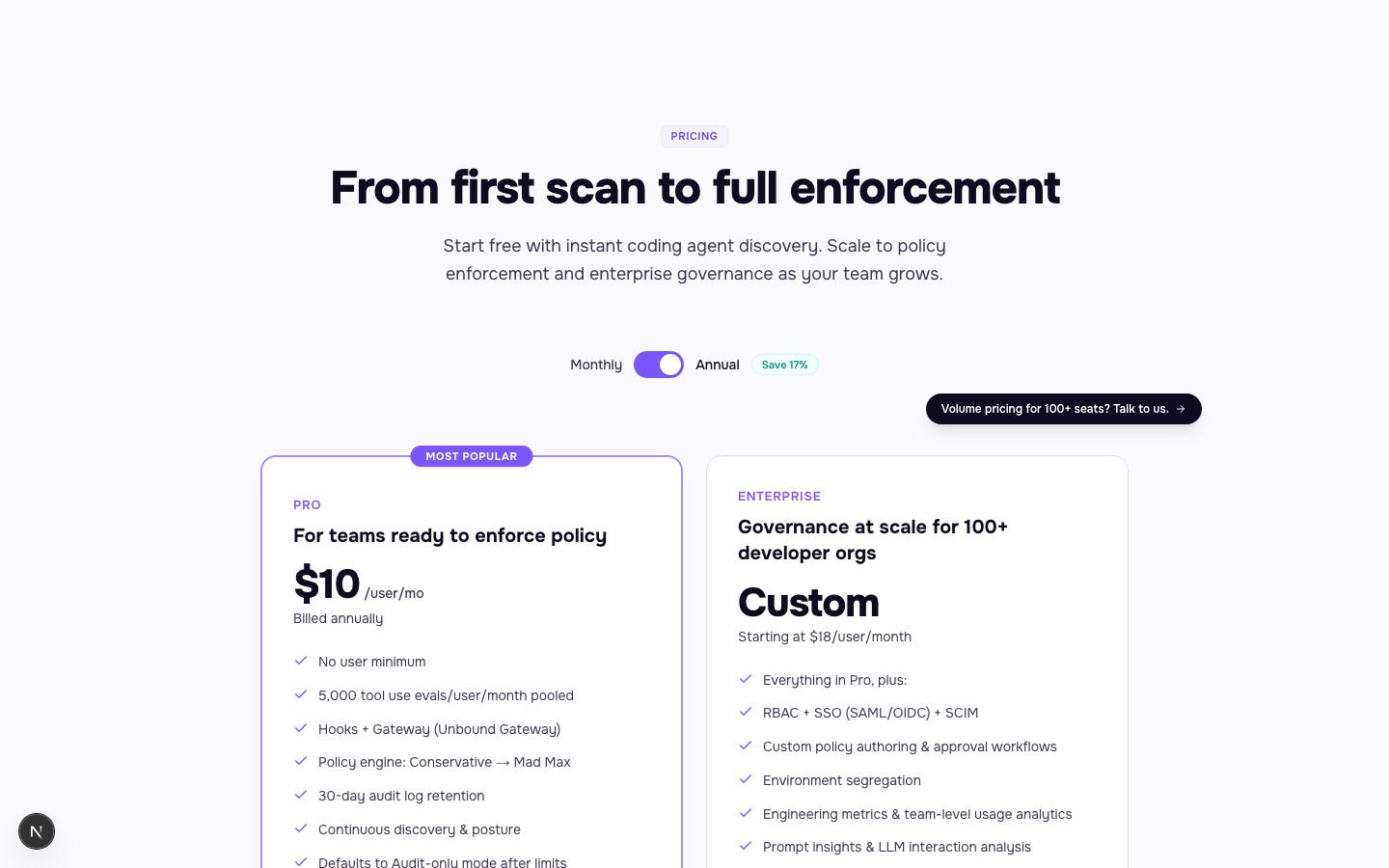
Unbound/pricing
- "MOST POPULAR" pill on the cheaper tier and a "Save 17%" green chip on the annual toggle. Both are common SaaS pricing patterns.
- Two mirrored checkmark lists. The Enterprise list is just longer, not visually different from Pro, and both tiers share the same card chrome and CTA treatment.
- $10/seat versus Custom is a wide gap. Nothing in the middle for a team trying to figure out where they fit.
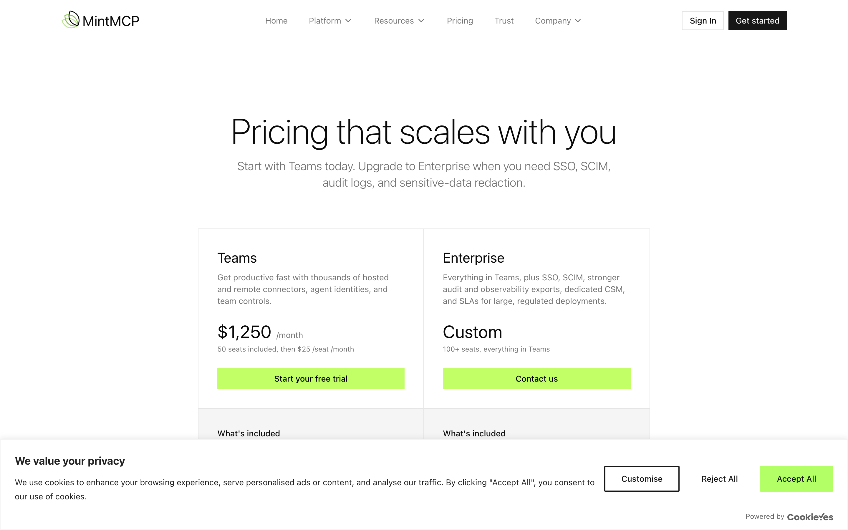
Mint MCPmintmcp.com/pricing
- No "MOST POPULAR" pill, no annual/monthly toggle, no mirrored checkmark lists. Each tier has its own prose: Teams reads as "get productive fast," Enterprise as "SSO, SCIM, audit, SLAs."
- Transparent scaling on the Teams tier: "$1,250/month, 50 seats included, then $25/seat/month." A buyer can model what they'll actually pay without a sales call.
- The subhead does the recommended-tier work: "Start with Teams today. Upgrade to Enterprise when you need SSO, SCIM, audit logs, and sensitive-data redaction."
06 / 19
The companies I compared us with
All YC-backed, all from the last five years, all with small teams like ours, all in the dev tools or AI infrastructure space.
UnboundS24 · AI agent security · ~6 people
BrowserbaseS24 · AI infra · ~6 people · same batch
PorterW21 · Cloud deploy
ResendW23 · Email API
Trigger.devW23 · Agent workflows
HeliconeW23 · LLM observability
I had to leave Greptile out because their site blocked the screenshot tool I was using. Skipped Cursor, Linear, and Modal as well, since they're past 10 people now. Everything captured on May 25th against our live main branch.
07 / 19
Landing pages, side by side
Same page type, six teams, captured the same day. Worth spending a few seconds on each one.
Unbound/
A pill eyebrow at the top, gradient text on the headline phrase, a mock dashboard, and a few floating background blobs. Most of the patterns I've been seeing on similar sites are present here.
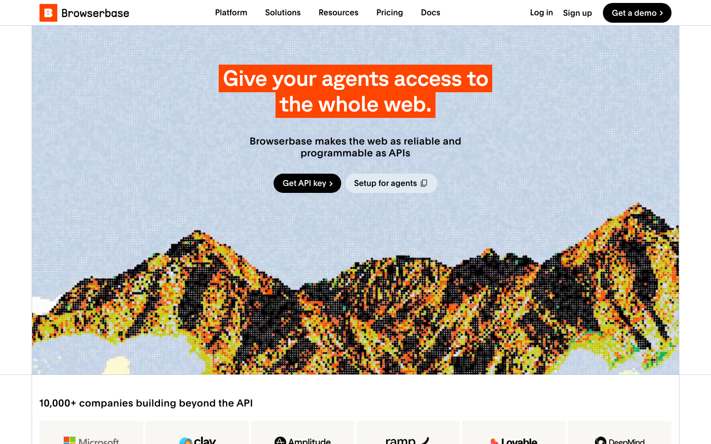
Browserbase/
A cream background with one photorealistic mountain illustration carrying the whole hero. A black tag highlights a single phrase in the headline.
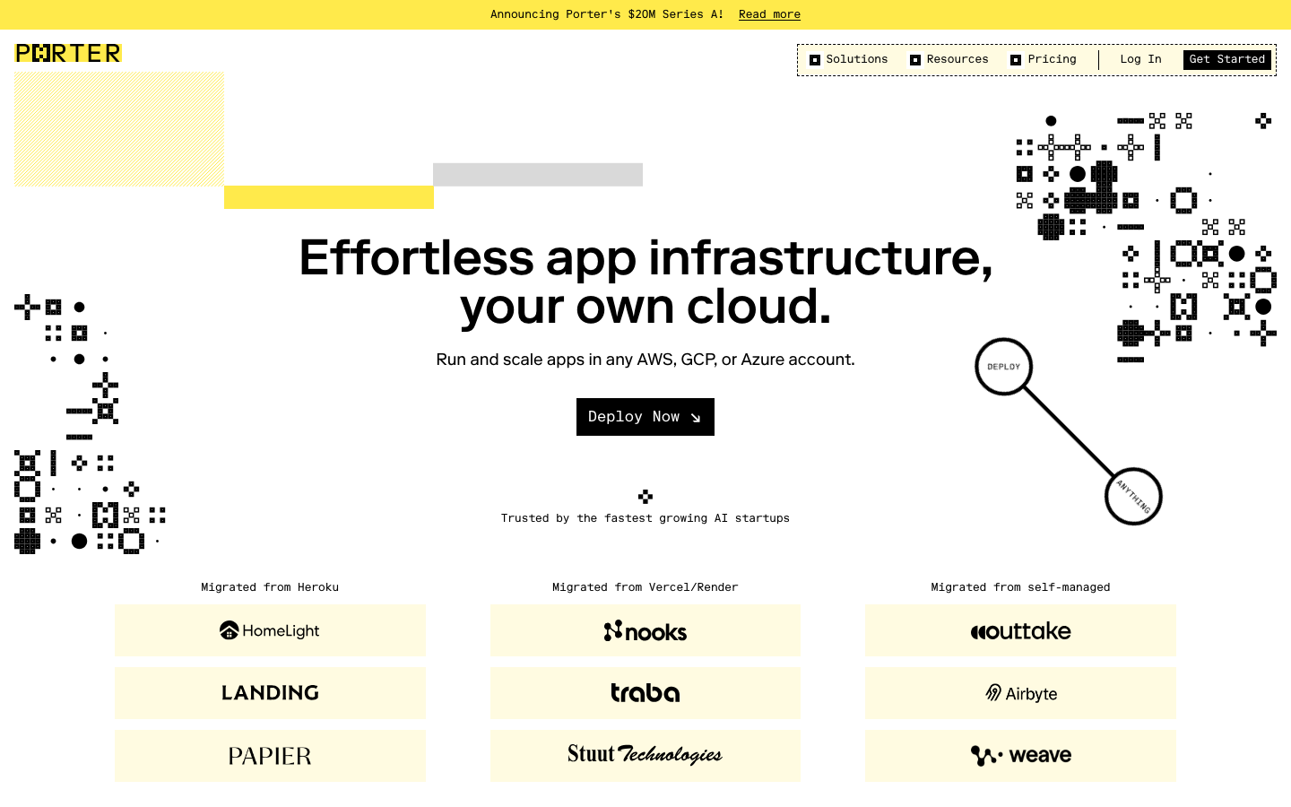
Porter/
Butter yellow announcement bar, hand-drawn pixel art in the corners, and a sketched annotation between two circles in the upper right. Fairly distinctive visual vocabulary.
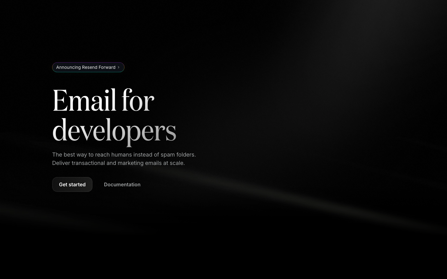
Resend/
Pure black background. The headline is three words with no qualifier. The restraint itself feels like part of the brand.
Trigger.dev/
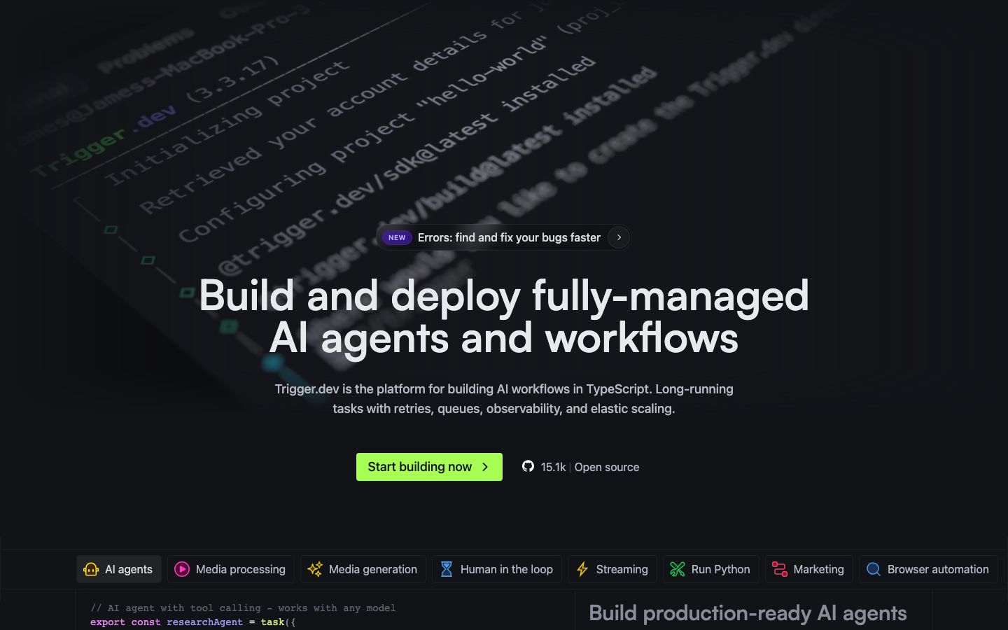
Black background with electric lime as the brand colour. Their hero anchor is a real terminal screenshot rather than a mock.
Helicone/
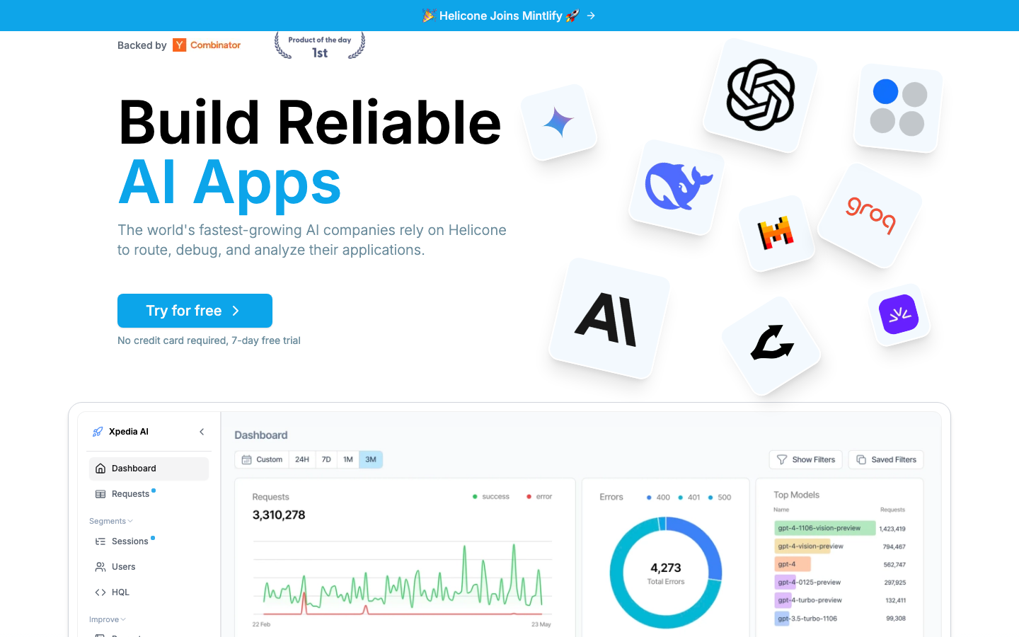
Their hero shows a real dashboard with real metrics like 3.3M requests. A grid of LLM provider logos sits next to the headline as customer proof.
08 / 19
Pricing pages, side by side
The page where someone decides to actually pay. I think it's worth asking how ours feels next to the others.
Unbound/pricing
A "MOST POPULAR" pill on the cheaper tier, a green "Save 17%" chip on the annual toggle, and two mirrored checkmark lists. These are common SaaS pricing patterns.
Browserbase/pricing
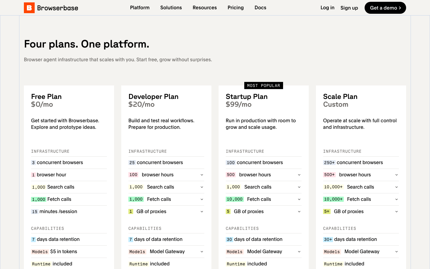
Compact tier cards without a "most popular" pill. The recommended tier is marked just by using their brand orange colour.
Porter/pricing
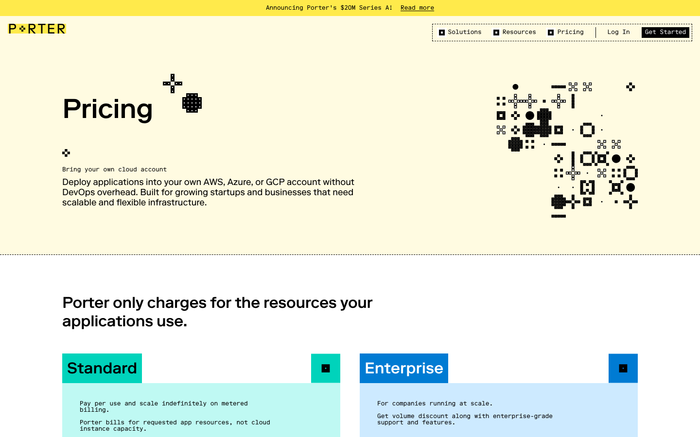
Cyan and light-blue colour-block tile cards. They use prose to describe each tier rather than a checkmark list.
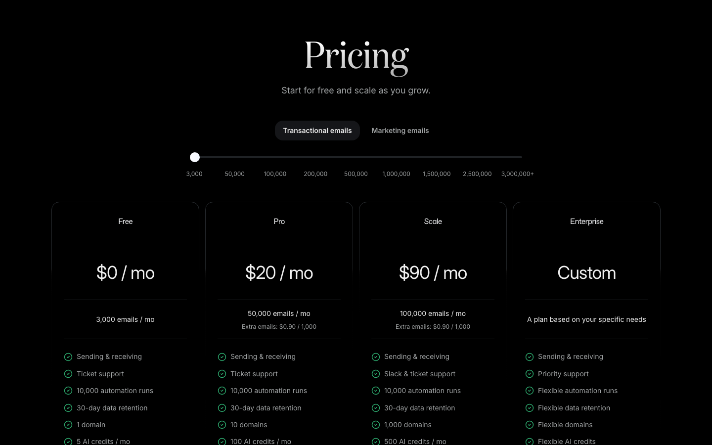
Resend/pricing
A slider above the tiers that lets you input your email volume and see which tier fits. The user matches themselves to a tier rather than being told which one.
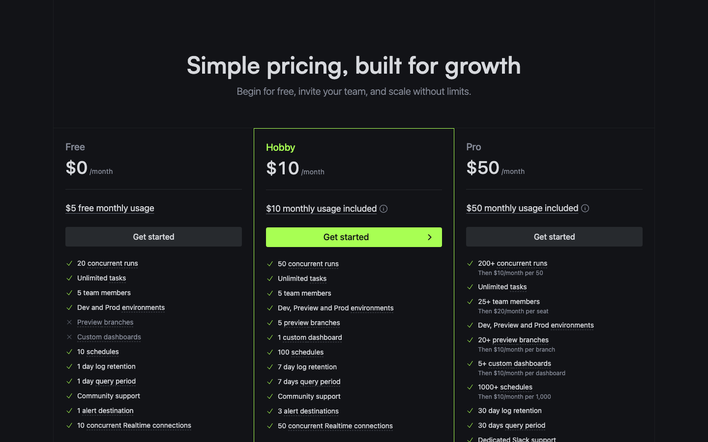
Trigger.dev/pricing
Their brand lime colour frames the recommended tier, doing the work a "most popular" pill usually does.
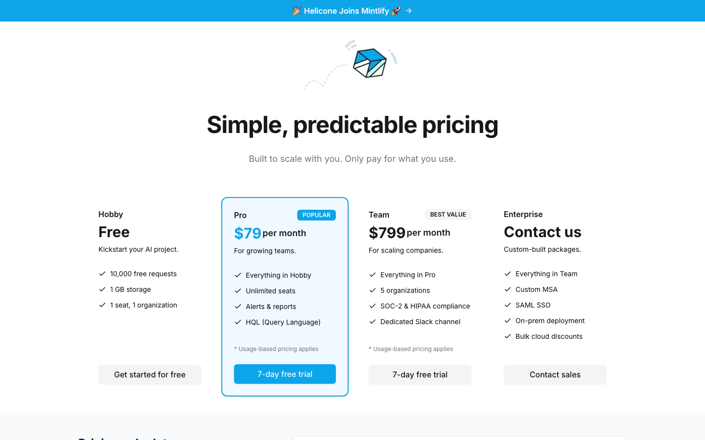
Helicone/pricing
A clean four-tier grid with restrained styling. The pricing numbers are doing most of the visual work.
09 / 19
Product narratives, side by side
The deeper-dive page, or the section that plays that role on landing for teams that don't have a dedicated one.
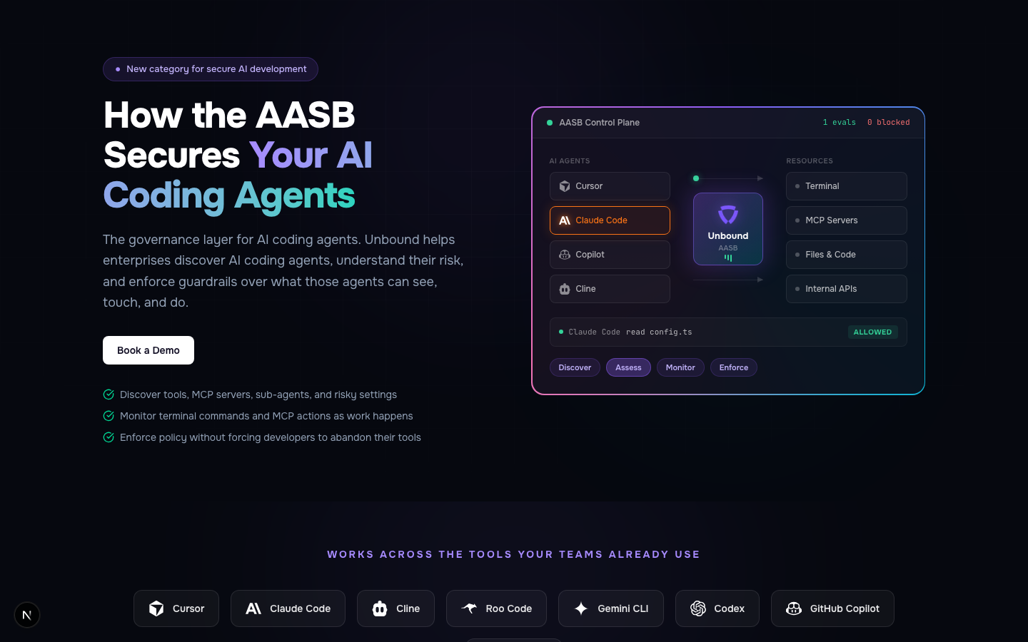
Unbound/product
A pill eyebrow, gradient text on the phrase "Your AI Coding Agents", and a mock control plane with placeholder numbers like "1 evals, 0 blocked" next to the headline.
Browserbasedocs intro
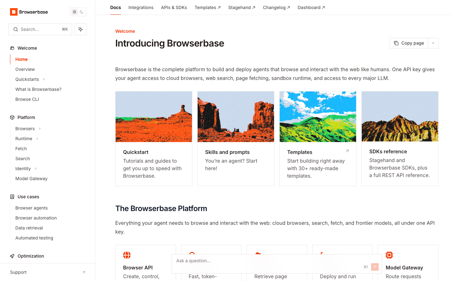
Their docs page tells the product story with image cards showing real templates and SDKs. Real screenshots rather than a mock.
Porterlanding scroll
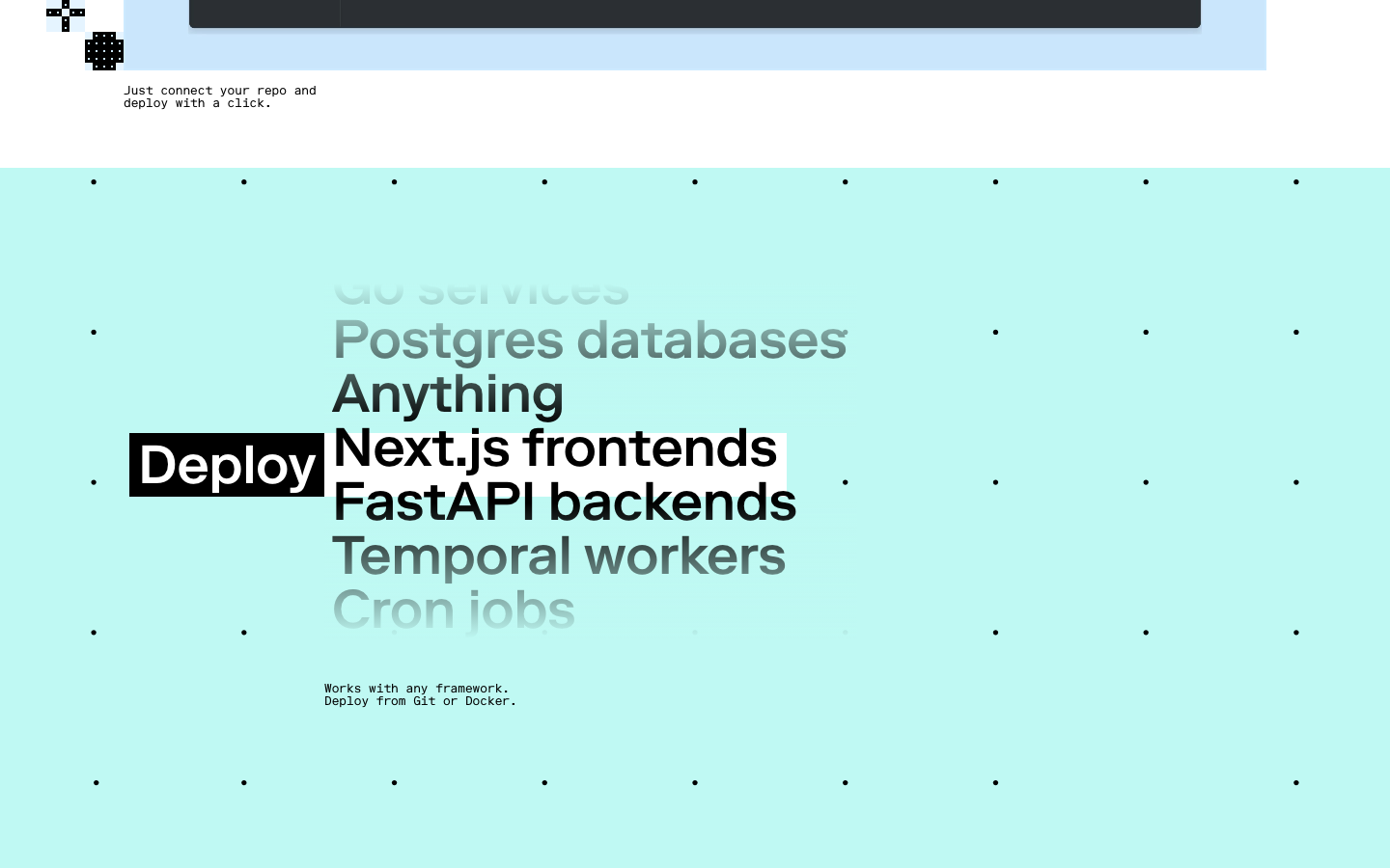
Porter doesn't have a dedicated product page. The landing carries it, using a headline that swaps in different framework names ("Deploy [Next.js / FastAPI / Cron]").
Resend/features
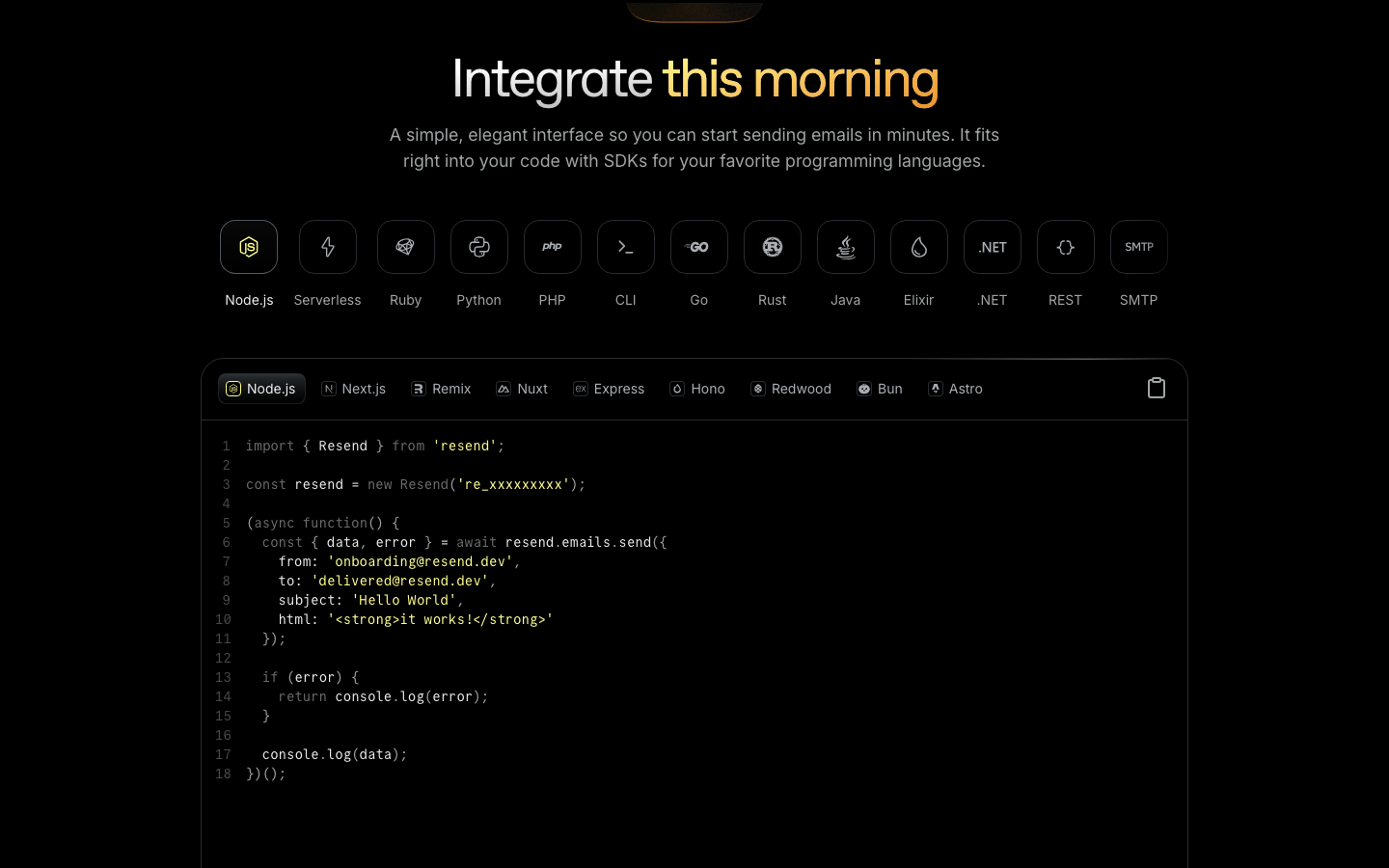
Their features page has "Integrate this morning" with the last two words set in italic serif. Below that, real SDK code samples in 13 languages with framework tabs.
Trigger.dev/product
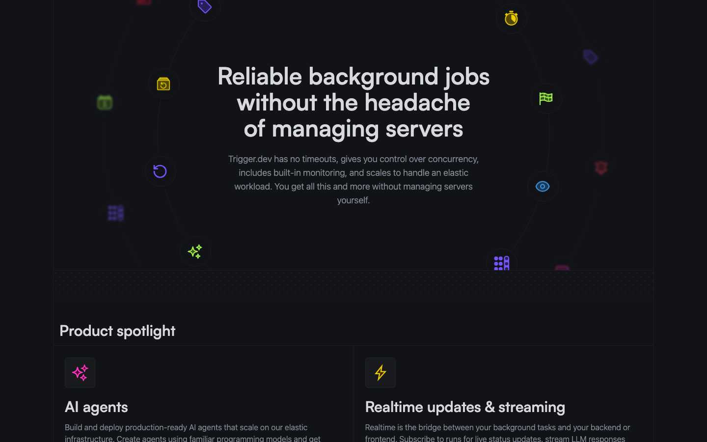
A decorated 3D-icon hero on /product, then a "Product spotlight" grid below with their real feature names. They've avoided showing fake UI entirely.
Heliconelanding
No separate product page. The landing already shows a real dashboard with real metrics, so it doubles as the product narrative.
10 / 19
How I scored each axis
Single-reviewer scoring (me), so I'd be happy to be wrong on any of these. 1 means I see a clear gap, 2 means roughly on par, 3 means ahead. Click any axis name for the four-line write-up of how I got to that number.
Axis
Unbound
Porter
Browserbase
Resend
Trigger
Helicone
1
3
3
2
3
3
1
3
3
3
3
2
1
3
2
3
2
2
1
3
2
3
3
3
1
3
3
3
3
2
2
3
3
3
2
2
1
3
2
3
3
2
1
3
3
2
2
3
2
3
3
3
3
2
1
2
2
3
2
2
Total / 30
12
29
26
28
26
23
Six rows where I scored us as behind. The four deepest-red ones (hero anchor, real product UI, section variety, colour identity) seem to share a single underlying issue: the site reading as templated. That's what most of the next few slides are about.
11 / 19
Unbound · /productMock UI
Our AASB Control Plane mock is well-made, but it could front almost any security product with a logo swap. It doesn't tell you it's specifically ours.
Browserbase · S24Owned art
Their hero leans on one photorealistic illustration. It's clearly something only they would use.
Trigger.dev · W23Real product
Their hero shows real terminal output, so the visual is the proof itself rather than a stand-in for it.
12 / 19
Unbound · /12% purple tint
Purple shows up across the site at low opacity, as faint backgrounds and small accents. It reads to me more as default chrome than as our identity.
PorterButter yellow
They use yellow, cream, and black as actual section backgrounds, not just chip accents. The colour is doing real work.
Trigger.devElectric lime
Their commitment to lime is strong enough that on pricing it doubles as the recommended-tier indicator, so no separate pill is needed.
What I'd try
Keep purple, but use it more deliberately. Save it for the primary CTA and maybe one editorial accent per page, and ease the violet decoration back everywhere else.
13 / 19
UnboundMock
Our mock has placeholder metrics like "1 evals, 0 blocked." Realistic-looking mock UI seems to be one of the stronger signals that a site was AI-generated, which is the irony point from slide 2.
Helicone · W23Real dashboard
Their hero shows a real dashboard with real metrics: 3,310,278 requests, 4,273 errors, real model IDs in the Top Models list. The numbers are the proof.
Resend ships real SDK code samples in 13 languages. Trigger.dev ships real CLI output. Looking at all five, it seems like either a real product screenshot or a deliberately stylised illustration both work. The middle option, a realistic-looking mock, is where things go wrong.
14 / 19
Unbound/product
Four feature sections all follow the same pattern: badge, centered H2, 580px subhead, then a grid. Same skeleton every time.
PorterSection 2
Variable-substitution headline with chip highlights. "Deploy [Next.js / FastAPI / Cron]" with the chips visually distinct.
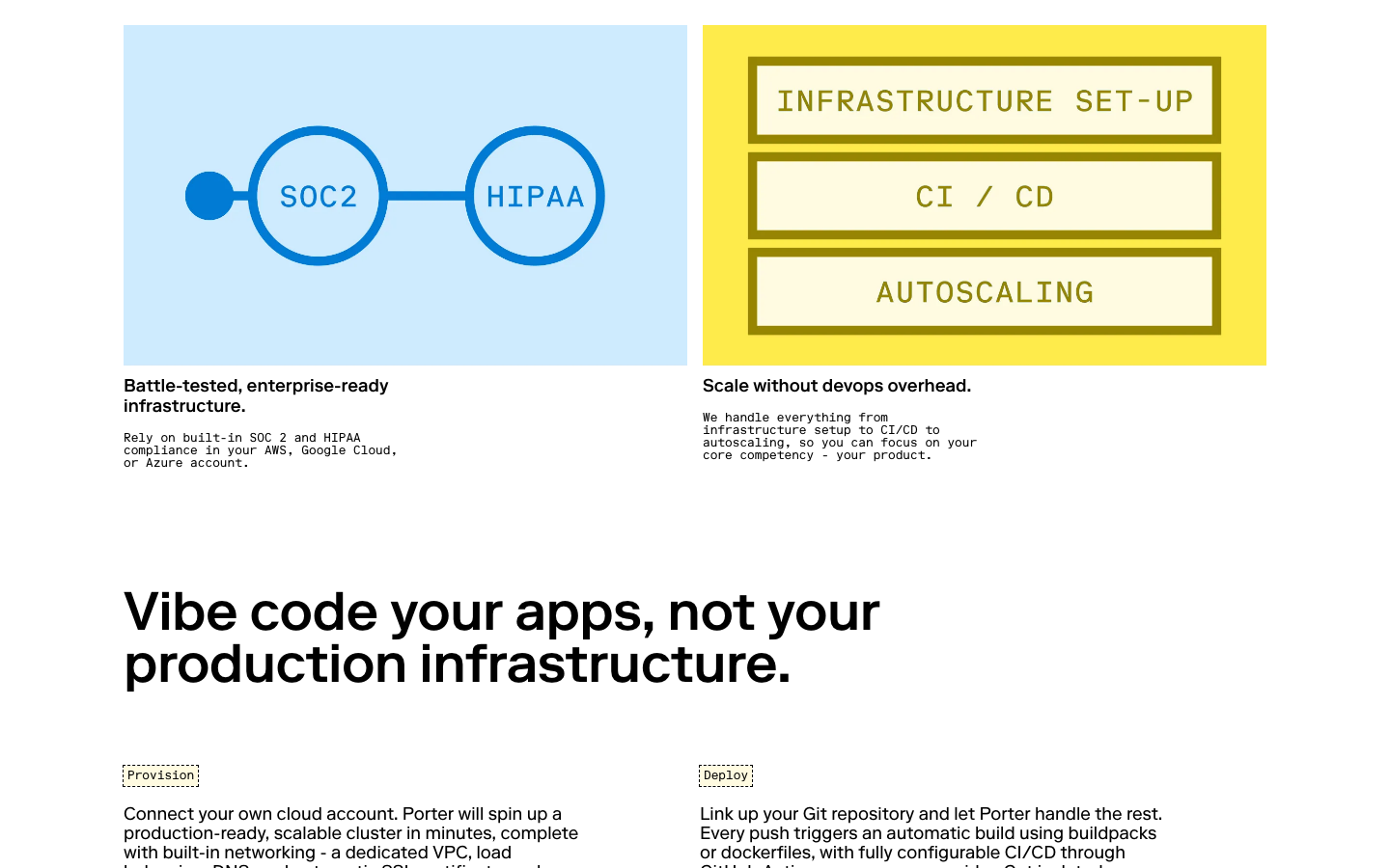
PorterSection 4
Colour-block tile cards in cyan and yellow. Same page as section 2, totally different layout.
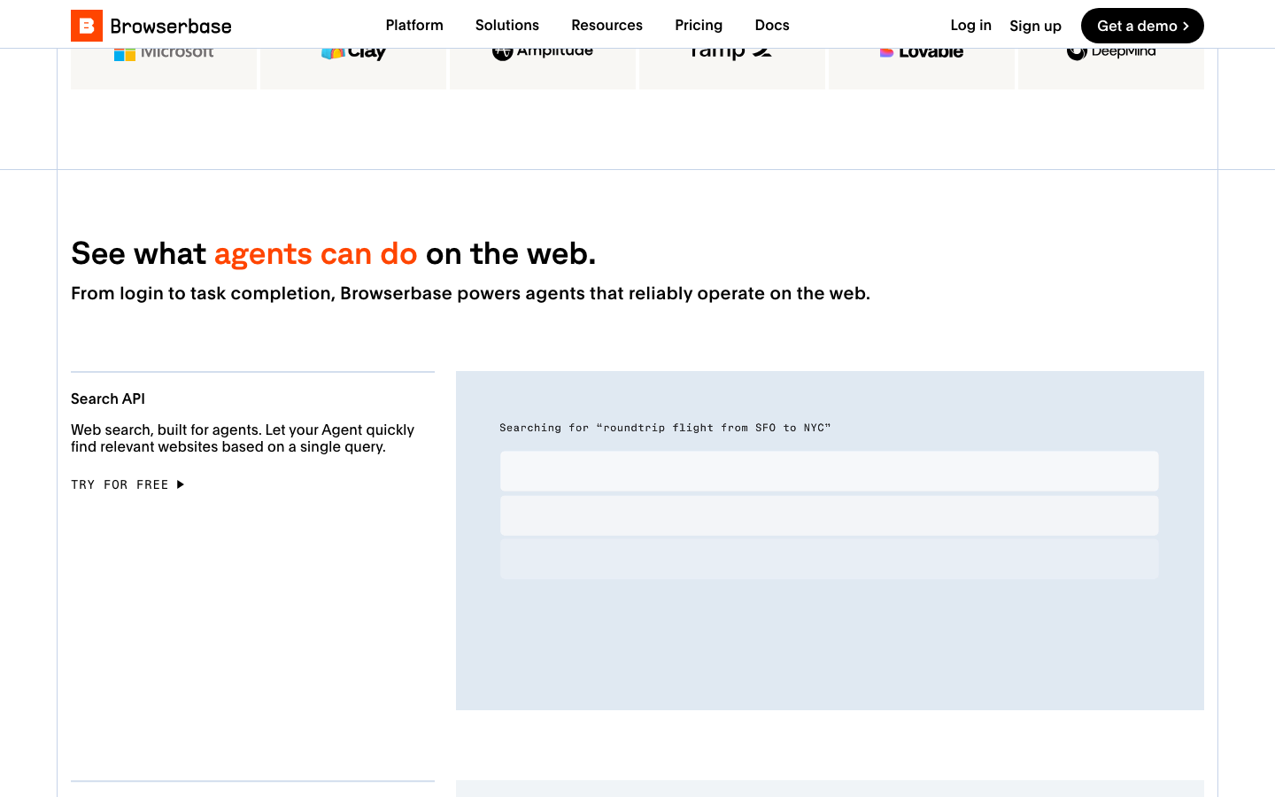
BrowserbaseFeature
Plain two-column layout with brand orange on one phrase. It's different from their hero, and different again from the next section.
15 / 19
Gap #5 · Pricing
Our pricing page shares a lot of patterns with other SaaS pricing pages.
Unbound 1 · peer avg 2.6
UnboundFamiliar pattern
MOST POPULAR pill, "Save 17%" chip, and mirrored violet checkmark lists. All three are common SaaS pricing patterns that have become very recognisable.
PorterColour-block tiles
Colour-block tile cards with prose descriptions instead of checkmark lists. Each tile reads as a story for its tier.
Trigger.devBrand as indicator
Their brand lime frames the recommended tier, doing what a "most popular" pill usually does.
16 / 19
Things I think we already do well
- The voice on /solutions/engineering. The line "You shouldn't have to choose between pressing yes and going YOLO mode" is the most distinctive sentence I found across any of the six sites. If we can spread that voice across the rest of the site, a lot of other things become easier.
- The OLD MODEL / BREAK / FIX diagram on /about. It explains the AASB category in three columns in a way I haven't seen on Browserbase or Helicone. Worth keeping, and maybe lifting higher in the site flow.
- The before / after terminal comparison on /solutions/engineering. Real CLI output, real diff. This is the kind of thing Trigger.dev would respect, and we could probably use it more prominently elsewhere.
- The /aasb-glossary page. Out of all the pages I looked at, this one has the least synthetic feel. The chrome restraint there is the design vocabulary I'd want to extend to the rest of the site.
17 / 19
What I'd try if we wanted to close the gap
Roughly three changes that I think could move the score from 12 toward the low 20s, probably over about three weeks of focused work.
01
Replace the mock UI with something real, or commit to bespoke illustration
This seems like the highest-leverage change to me. It closes two scorecard rows at once (hero anchor and real product UI). The call I'd want input on is whether the actual product is screenshot-ready, or whether the right path is to go in the other direction with a deliberately stylised illustration.
02
Use purple more deliberately, and pull it back everywhere else
I'd pick a single shade (the design spec I wrote suggests #5B3DF5) and use it at full strength on primary CTAs and one editorial accent per page. The violet decoration on feature sections, badges, and mini-pills would come off, so the same colour ends up doing less work but more visible work.
03
Rebuild the /product and /solutions/security feature sections
If we did this, each of the four sections would use a genuinely different layout (asymmetric two-up, full-bleed band, comparison table, editorial pull-quote, and so on). The detailed menu is in the design spec. This is what I think removes the strongest "templated" signal from the site.
18 / 19
Where things stand, and
where I think this could go next
What I've explored
- I went through most of the non-landing pages and quietly cleaned up the patterns I could identify: the gradient text on headlines, the drifting glow shapes in the background, the small pill-style labels, the teal accents, and the staggered scroll animations.
- Those changes are sitting on a separate branch, so nothing is touching production yet.
- I left the landing page mostly alone. It has the most going on visually, and I wasn't confident I could improve it on my own without breaking the parts that already work.
What I think could come next
- The more I compared us to the peer sites, the more I started to notice that the gap isn't really about specific elements being wrong. The peers above seem to have an underlying visual identity that everything else hangs off, and we don't quite have one yet.
- None of those teams got there by polishing defaults either. Each of them has something distinctive (a colour, an illustration style, a typographic moment) that feels like it came from a real design decision early on, not from iterating on a starting template.
- If closing this gap is something we want to do seriously, I think this is probably the point where bringing in someone with proper design experience could add more value than another few weeks of edits from me.
19 / 19